Responsive & Minimalist Design – The New Trendsetter
Responsive design trends have been changing day by day. Now it’s all about user engagement/connection with the content of the Website/ Application. Mobility has been a great factor for designers around the world to change their approach to web design.
Below are the Responsive Design Trends that Create Revolution in Web-Design Industry:
Personalized User Experience
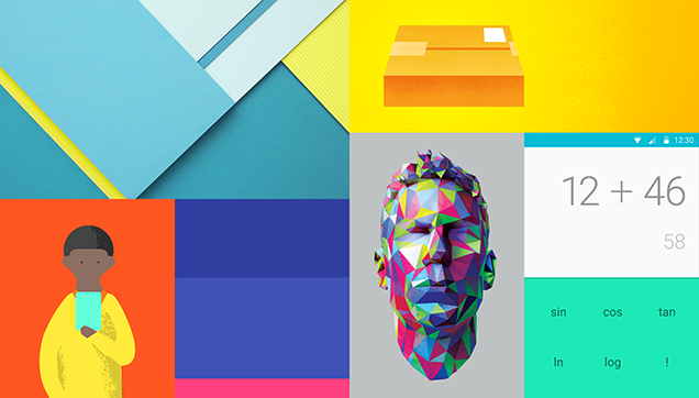
Modern Minimalist Design
Big Emphasis on Typography
Large and Beautiful Images & Video for more user engagement
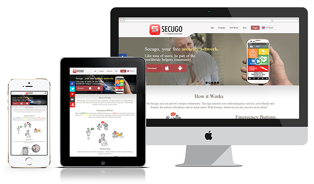
Responsive web design (RWD) is an approach to web design aimed at crafting sites to provide an optimal viewing experience—easy reading and navigation with a minimum of resizing, panning, and scrolling—across a wide range of devices (from desktop computer monitors to mobile phones).
Though it’s not the same design technique as mobile app designs. Mobile design entails creating an entirely new website or web app with content specifically created for the mobile experience. Responsive Design, on the other hand, means that the same domain, the same content, and the same syntax — more or less manipulated by JavaScript and/or CSS3 Media Queries — respond to different viewports to provide the best user experience possible for each device. The different platforms include desktop monitors, laptops, tablets, and mobile devices and their corresponding orientations.
10 Tips for Responsive Design Layout:
1. Go Mobile First
Before you plan your design for desktop or laptop screens, think about the user experience on a mobile device. A lot of designers are embracing the mobile-first movement. This strategic approach should be used not only while Visual Design but it’s suggested to follow in the analysis phase (wire-frame design).
Why? Because mobile is becoming more relevant than desktop.
Approximately 1 in every 7 people on earth use their mobile devices to access the internet. Focus on how users interact with your website over their mobile phones first. It helps designers to analyze and prioritize the data, content, imagery, video, etc. for less real estate. It also helps to manage interactivity.
For example, We use a cursor for interaction on desktop/laptop but smartphones use touch and/or gestures so we have to design in such a way that we use less hover effect. The hover effect does not work on touch devices.
2. Design with Media Queries and Percentage
Media Queries is a CSS3 module allowing content rendering to adapt to conditions such as screen resolution (e.g. smartphone screen vs. computer screen). It became a W3C recommended standard in June 2012. and is a cornerstone technology of Responsive web design.
Earlier most websites were designed using fixed-width layouts but the introduction of minimalist design ideas created a hell lot of challenges for designers such as deciding content breakpoints, maintaining UX, maintaining visibility, etc. One of the hardest parts of responsive design is implementing a fluid grid.
A fluid grid works together with media queries to display content on different viewports. Instead of designing breakpoints for every possible viewport, you set a maximum layout size. From there, you define the widths and height by proportion, not pixel. This allows the site to rearrange the layout based on percentages.
3. Understand What Mobile Means for Users
People interact with websites differently over a smartphone than they do over a desktop. Since mobile is a handheld device so “User Engagement” becomes a necessity for any website. Unlike browsing on a desktop, users will ignore long textual content and too much detailed information will make the entire experience boring.
So being a designer we all need to prioritize and analyze data and make it interesting information using info-graphics, imagery, etc. Good use of Typography also plays a vital role in creating interesting textual info.
4. The Need for Speed
Don’t let those images drag your responsiveness down. Quickly scale down hefty images with tools like Adaptive Images and TinyPNG. It’s the demand for responsive designs. It becomes our duty to keep things simple so that user experience does not get affected by slow internet as well.
Keep this noted, faster sites reap the maximum benefits, and every second makes a difference. Yes, statistics say that web pages with 2 seconds of load time have an average bounce rate of 9%, while pages that take longer than this have their bounce rates skyrocket to 38%. This clearly shows, how important it is to follow the minimalist design trend to keep your website optimized for faster loading and enhanced user experience
5. Eliminate Unnecessary Elements
It plays a big factor. Get rid of excessive elements, not only for your user experience but also for the website’s speed. A website weighed down by too many elements will not be pleasant to use or to look at.
6. To Hamburger or Not to Hamburger
This is also a very important but most difficult part. Sometimes it becomes very irritating for users to go into the menu to navigate to a specific page. A user wants the main navigation should be accessible all the time. So we have to design cleverly to identify which links we need to show or which items we can keep in the menu. It also depends upon the business requirement.
For example: If we are designing for a fashion brand which is serving to all age groups. We should atleast show the primary sections (Men, Women, Kids, etc.) on the main screens. Further drill down of navigation can be arranged in the menu.
7. Make it Readable
Don’t make your users squint to read or pinch-to-zoom. Make your text size large enough to read from a smaller screen. Recommended text sizes for mobile devices are 16 px, 1 em, or 12 pt.
8. Use the Right Button Size
Most smartphones are touch-based. We need to keep a standard size for action items. According to mobile responsive design guidelines, one should design action items a minimum of 44 x 44 px for comfortable tapping. Also, it is suggested to use at least an 8px gap between two action items to avoid any kind of overlapping on tap.
9. Design for Screen Orientation
It all depends on the intent of the image and the way you want to compose it. Design your site to look good in both orientations, but pay more attention to the landscape, follow the right design thinking approach, and make sure that your images aren’t stretched.
10. Fluid Grids Solve the Purpose
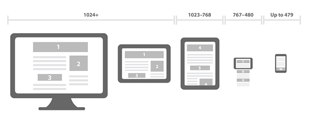
A Gird system is required for responsive design. It gives you flexibility and full control. It allows you to decide the content breakpoints, prioritize the element, and make a visual hierarchy. The Grid Systems are designed for “Mobile First”. CSS styles are scaled up from the minimum instead of scaled down from the maximum through the use of media queries.
There are a few common breakpoints for fluid grid: 320 px — Mobile portrait
480 px — Mobile landscape
600 px — Small tablet
768 px — Tablet portrait
1024 px — Tablet landscape/Netbook
1280 px & greater — Desktop
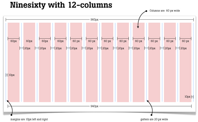
Below is the example of a 960 PX based 12 columns fluid grid. The number of columns and breakpoints can be easily decided depending on the above-mentioned breakpoints.
Don’t s for Responsive Design:
Don’t penalize users for the device they happen to be browsing with.
Don’t hide content from mobile users – change the content to make it accessible to all.
Don’t clutter the design and add unnecessary items – Prioritization is key.
Don’t over-bloat pages for mobile users – remember 74% of mobile users will leave after 5 seconds of waiting for a page to load, and the unfortunate reality is that only 3% of small screen versions of responsive sites are significantly lighter than their large screen counterparts.
Don’t make text links so small that they can’t be clicked on when browsing using a mobile device.
Don’t use dual gestures for touch devices. For example Drag and drop.
Don’t use small action items, especially for touch devices. The minimum size of an action item should be 44×44 px and the distance between two action items should be more than 8px.
Don’t use 1x images for retina display. It should be 2x in size.
Conclusion
Level up your knowledge with expert insights and resources straight to your inbox
Hope this will help you all designers to showcase your skills for responsive design to the world of web development and help you to avoid mistakes for successful web design. Need more help in making an attractive and engaging web solution? Team mTraction Enterprise will help you overcome all the web design difficulties to make content responsive.
 menu
menu


