The 5 Must Have Features: How To Make Retail Apps That Actually Sell
Well-made retail apps can boost your overall sales and contribute a large chunk of revenue to your existing business. Learn more on how to make one: Today, most online shopping purchases happen on mobile phones. If you have a brick-and-mortar retail brand or an eCommerce website then it’s smart to invest in a retail mobile app.
Revenues may not skyrocket with just another mobile app that is not built to meet user behavior and expectations. Sales and conversions need well-built apps with a well-planned strategy around UX and well-designed UI teamed up with a sound go-to-market strategy.
For your convenience, we have put up a checklist of five’ must-include features that will make the users click and buy from your m-store.
1. Design for Multiple Devices
Enough has been said about mobile responsive design! Developers, Designers, Marketers, and Entrepreneurs have understood that building e-commerce stores for mobile devices and tablets requires an understanding of mobile layouts. What biggest app design mistakes developers need to ignore is taking fluid responsiveness lightly. Design branches into two other categories: Fixed and Fluid.
With a fixed design, the layouts may or may not adjust well to all device screens. The retail mobile app may look and perform brilliantly on one Android device but the elements and typography may not adjust well to another screen of different dimensions thus marring user interaction. For retail app development, aesthetics matter a lot more than any other utility app. What looks good, sells better. If you employ only fixed responsiveness the text in your app may look jagged on a tablet screen or the product images and blocks may be slightly distorted.
What is the solution to this fluid design?
Fluidity means that all design elements like text, typography, and graphics follow a simple rule of screen size percentage, i.e., the area covered by an element adjusts according to the percent space of the available screen in height and width. This means that your retail app aesthetics remain intact. The principle of fluid design and viewports applies primarily to web apps, hybrid app developers need to take a cue.
It may or may not be possible to use high-resolution images always owing to the lesser response time needed in apps. It’s advisable to use the high resolution to accommodate the retina display in Apple and luxe Android phones. SVGs (Scalable Vector Graphics) for logos and graphics should be a standard adoption.
2. User-Friendly Categories, Filters, and Sorting
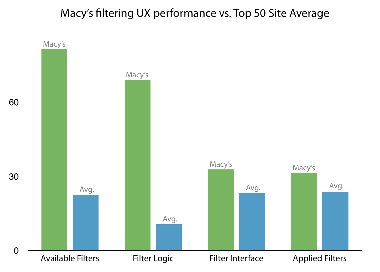
Think like your user. Once you are on a retail app’s home page the first intent is to go to the categories to narrow down the products. Filtering/sorting logic is a part of the greater scheme of UX design and user workflow. All eCommerce websites and apps sort their products and categories to maximize sales and revenues. Sound research data from Baymard’s on eCommerce product list usability makes a good reference to understand how one should design and sort product lists. Though the research is based on optimizing product lists on websites from our experience in developing apps in retail we know that this can be extrapolated to apps. Baymard further illustrates the best filtering practice as implemented by Macy’s.
Six Practices that are Relevant to Retail Apps:
Show category-specific filters.
Put important, most relevant filters and categories on the top.
Allow multiple filters of the same type (for example sizes in S and M if the user is searching for both, multiple colors, and multiple brands.)
Use thematic filters (especially for retail clothing and accessories apps, themes based on real-life descriptions help the user narrow down preferences.)
Truncate the applied filter lists so they don’t cover the unapplied filter options.
Display applied filters clearly for user convenience.
These are intricate findings of sound user behavior research. For an optimum retail app experience, they should be implemented into the core logic while developing.
3. Design Product Page Details:
The product page in retail apps is the showcase for the sellable. Important details like pricing, product description, product image, or the 360-degree view, cross-selling, and upselling displays should be included here. Cross-selling means that you display related products on the product page the user is buying from, for example showing a headphone along with a popular mobile phone is a good selling strategy. Upselling is when you display better brands and options that are slightly steeper than the existing product on the page.
The users may end up buying more from you. Product pages in apps with more visual information are more likely to perform better. High-resolution images and page responsiveness and loading time are the places to make a tradeoff. Wherever possible use high-quality images. Also, make the navigation from and to the product page easier. A good strategy is to have remarkable CTAs for better sales. Your user makes the crucial decision, ‘to buy or not to buy here. Design better product pages for better sales.
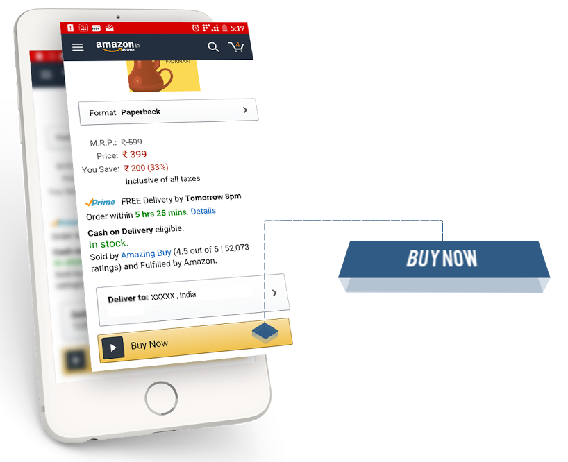
4. The Two Tap Rule for Check-Outs:
Marissa Mayer advocated the two taps for apps at the beginning of 2015. Since then designers have heavily debated the two-tap rule and how stringent adherence can actually reduce user interaction. True, one can not replace the much-needed interaction while gathering information and asking for user specifications. But, something as simple as a decision to buy shouldn’t be delayed by the number of clicks.
For mobile apps’ the two tap rule’ is a good yardstick on a product to cart and cart to checkout pages. Remember the controversial one click patent by Amazon? It has actually helped them make Billions. In mobile apps, they have a ‘Buy Now option that takes the user from the product page to checkout straight.
5. Payment Gateways for Secure Online Payments:
In certain regions of the world, where plastic money and online banking have penetrated in deep, online payments are preferred over COD. However, sharing credit card information directly with a small or midsized business retail mobile app is still a security taboo. One way of ensuring users actually buy without hesitation is integrating trusted payment gateways like Paypal, Stripe, and Paytm.
Integrating payment gateways/wallets into your retail app or redirecting to a payment gateways page are the two options you have at the checkout stage. Both options have their advantages and disadvantages:
Payment Gateway Integration:
Advantage:
You control the UX at the crucial transactional stage which means you could personalize the page for your benefit.
Disadvantage:
Since the user’s credit card information is passing through your app you will have to get PCI standards approval for the code. (PCI data security standards exist in the physical world and online, for credit card security.)
Redirecting to Payment Gateway’s page:
Disadvantage :
You may not be able to control the user’s experience since the page is a third-party entity. With a redirection and the ensuing lag, the user may also get hesitant about buying thus making a leaky hole in your sales funnel.
Advantage:
You have no compliances or standards such as PCI to seek certification for.
A sense of security will ensure your users do make that final decision to trust you with their money thus increasing sales. As an added measure you could include trust badges and win users’ trust.
Conclusion
Level up your knowledge with expert insights and resources straight to your inbox
The UX and UI of an app play a larger role in determining whether your users will buy from your app or not. Keep user convenience and app security in mind. At mTraction Enterprise we build our apps with secure development practices and great design. For a free consultation on re-designing your app and employing the right development practices contact us.